Growth Strategies
01.02.2023
TLDR
High-growth e-commerce brands employ various strategies to convert visitors into customers on their Shopify stores. These strategies include showcasing testimonials and trust marks, using social proof, regularly offering new content, learning visitor preferences for personalized recommendations, reducing friction for shoppers with free shipping and flexible payment options, compressing welcome emails into the first few days, adding countdown timers for promotions, and engaging visitors with informative quizzes.
Conversion is the most important metric for any e-commerce manager. You want to make sure that the ratio of conversions to the amount of traffic coming to your web store meets your expectations.
While offering discounts can be an effective strategy, this is not the only successful method used by direct to consumer brands. In this article, we take a look at various different strategies used by high growth e-commerce brands to convert visitors into customers on their Shopify stores.
Include testimonials and trust marks on your homepage.
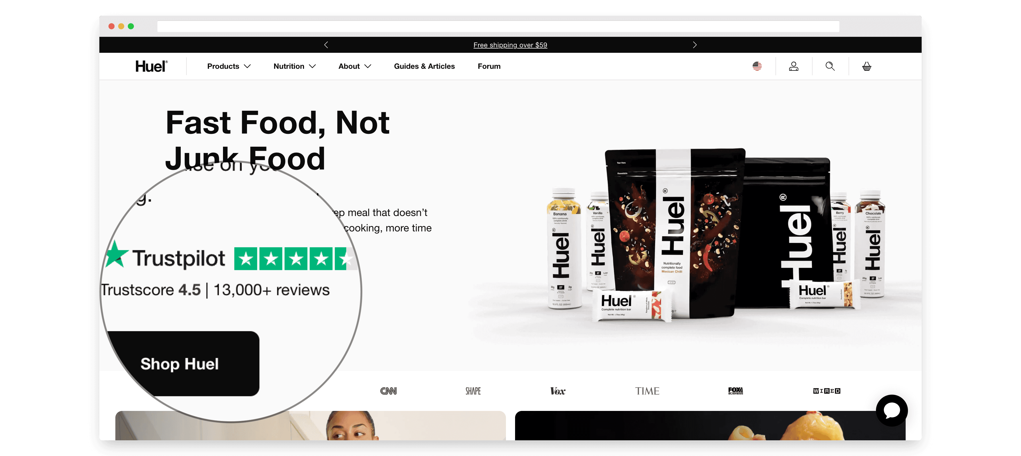
For newer brands, or products that may be less familiar to shoppers, it is important to show visitors that they can earn their trust. Meal replacement brand Huel makes use of Trustpilot ratings, putting their rating front and center on the homepage so visitors can see that Huel is a trusted brand.
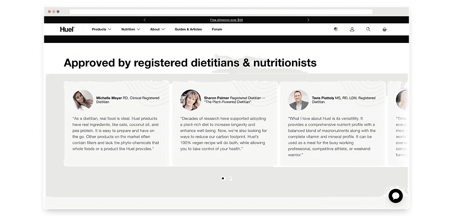
As their product relates to health and wellness, they also included testimonials from experts in the field to speak about the health benefits of their products. Meal replacements are not a staple part of most people’s diets, so this appeal to authority helps to persuade a visitor to try a product which is not yet widely adopted by consumers.
Use social proof to increase brand appeal.
For brands selling visually-oriented products, such as beauty products, aesthetics plays an important role in the marketing strategy. In particular, the brand wants to communicate that the products not only look good, they also make the user look good.
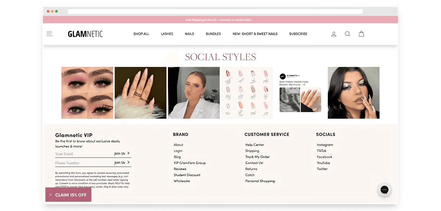
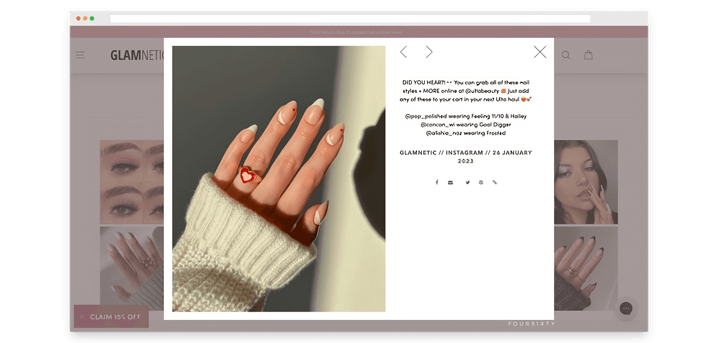
Beauty brand Glamnetic nails this strategy by putting social images on their homepage, imported from their Instagram feed. These posts are typically reposts of images shared by influencers online showing off Glamnetic products, offering visitors a view into how the products may look in the wild.
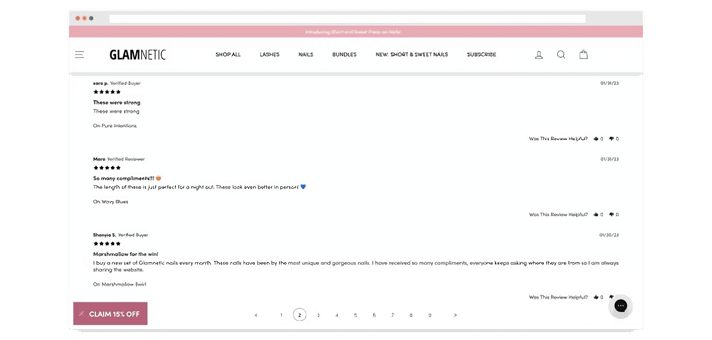
Reviews also play a huge role in adding to social proof on your website. While most reviews tend to be scattered across the various product pages, Glamnetic also consolidates all their reviews onto a single page so that a visitor can see all of the reviews in one go. Being able to see tens of thousands of reviews at once inspires confidence in visitors that they can trust the website and the products sold.
Offer new content regularly.
Apparels company Dixxon managed to find a market in limited edition drops that brings in US$20mil a year. The brand offers quality flannels in limited quantities, frequently collaborates with other brands, and focuses on one-off productions to create scarcity and motivate shoppers to buy before stocks run out. Dixxon releases several collections per month, with each drop putting US$50k in the bank.
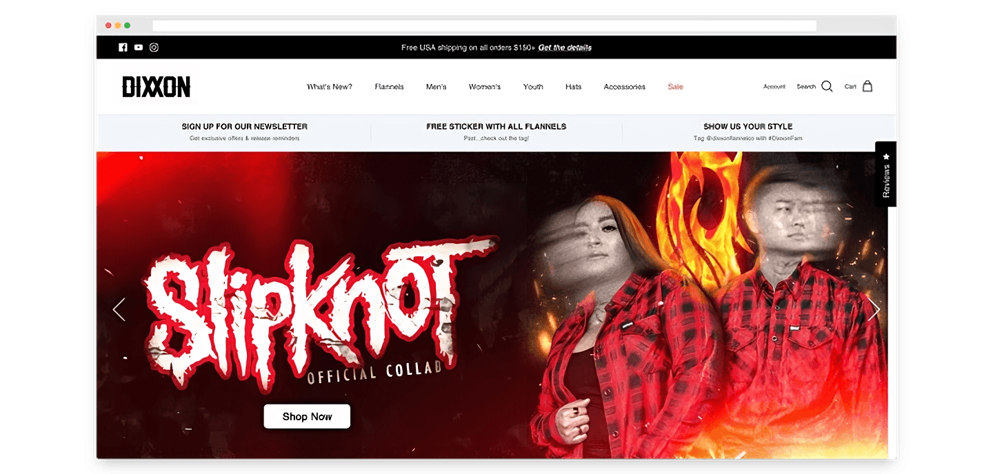
As they know their customers will only spend a certain amount on flannels alone, Dixxon manages to increase shoppers’ average cart value through offering complementary products so that their customers are tempted to spend more. By expanding their product line, they also multiply the types of new offerings they can share to their followers. To promote their new collections, they rely heavily on social media, where they have 570k followers across platforms. Read more.
Learn visitor preferences to give personalized recommendations.
Beauty brand ColourPop finds different ways to keep visitors on their site, resulting in an average session duration of 5m 50s—double that of the industry benchmark for e-commerce, at 2m 57s. Let’s take a look at some of their tactics.
On the ColourPop website, when a visitor clicks on the search bar, they are immediately shown suggestions based on popular search terms and trending products. They also show product images for the trending products, designed to catch a visitor’s eye and increase their interest in the products, which may lead them to click on a product listing and start shopping without even typing a single search term.
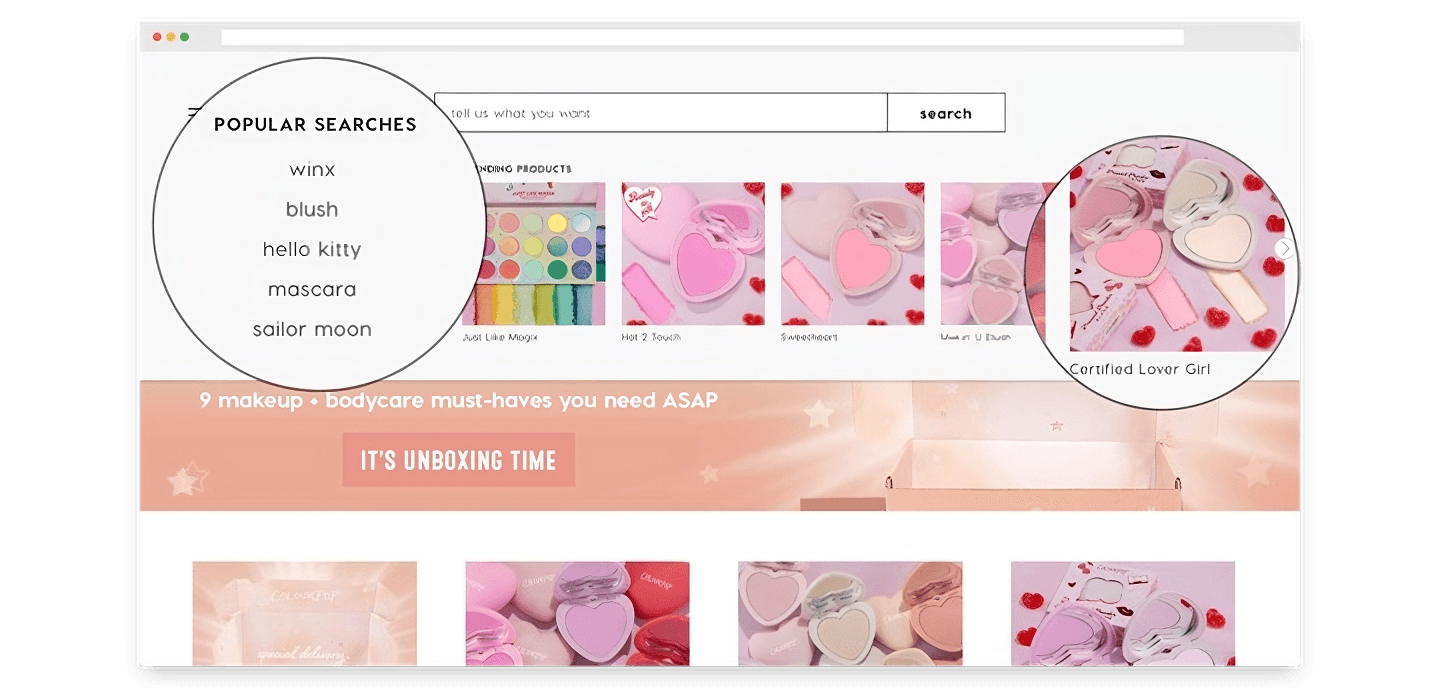
When a visitor starts typing in the search bar, ColourPop dynamically changes its recommendations based on what is being typed. They offer suggested searches, categories, and products, giving the visitor as much helpful information as they possibly can to guide them in their customer journey.
The effect of this is if a visitor had simply been casually browsing with no intention of making an actual purchase, they are now prompted to view and click on specific search terms, which helps ColourPop learn about their preferences and use that first party information to deliver more personalized recommendations, increasing the likelihood of the visitor making a purchase.
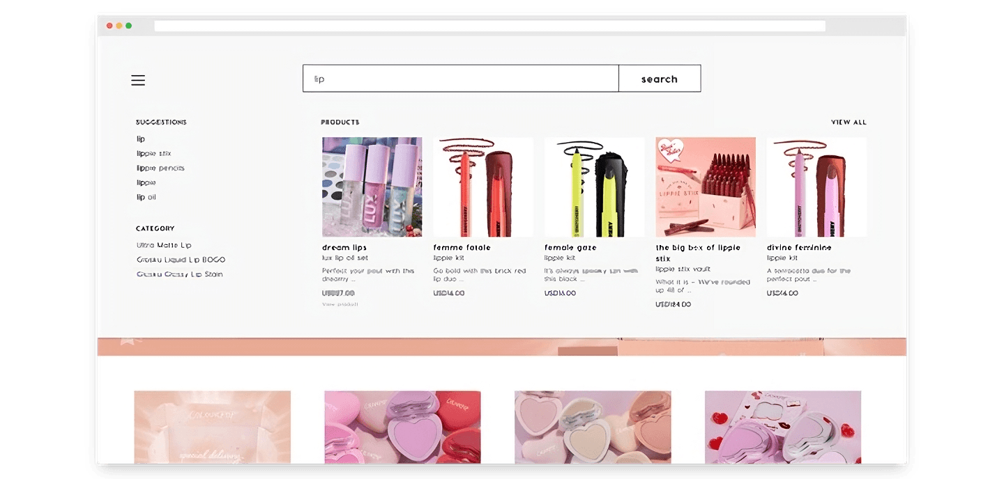
ColourPop leverages several different apps which they install onto their website to achieve their aim. They use tools like Dynamic Yield for automated conversion optimization and content personalization, Findify for real time personalized search recommendations, and Klevu to deliver AI-powered search results most relevant to the user. Read more.
Reduce friction for shoppers.
There are several quick wins you can make on your website to reduce friction for shoppers.
The first is free shipping. Most online stores offer this right at the top of their homepage, to encourage shoppers to spend on their store, or increase their cart value.
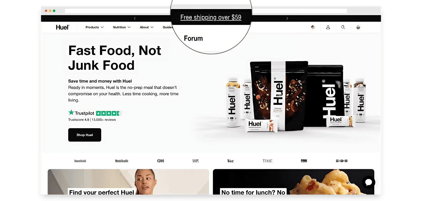
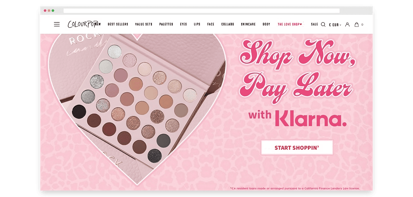
The second is offering buy now, pay later payment methods, such as Klarna, Afterpay, or Atome. This allows visitors to spend even if they can’t afford to pay the entire value of their purchase at the moment.
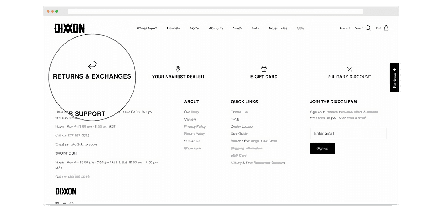
The third is being upfront about your store’s returns policy. Often, shoppers prefer to buy from stores that have a clear, easy to understand returns policy, in case of any issues post-purchase. Make it easy for customers to check your returns policy from the homepage, even if they have not yet made any purchases.
Improve your DTC game. Sign up for weekly tips.
Compress your welcome emails into the first few days.
For some brands, the strategy is less focused on on-page conversion, and more on nurturing buyers over a longer period of time through email marketing. This strategy tends to lend itself more to products at a higher price point, where customers make less frequent purchases. You can see this in effect on luxury bed linen company Brooklinen’s website, where the moment you click to browse their products, your customer journey is halted by a full screen popup aggressively prompting you to leave your email for a discount.
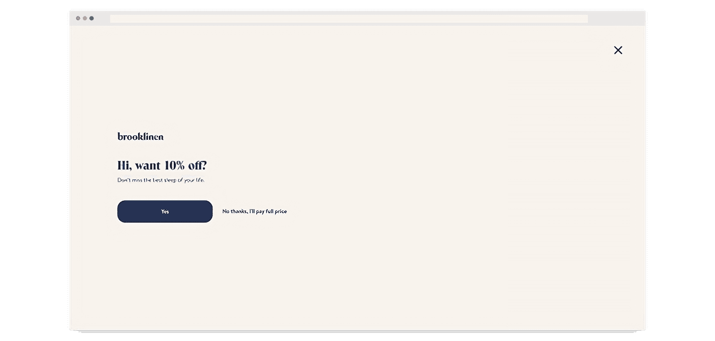
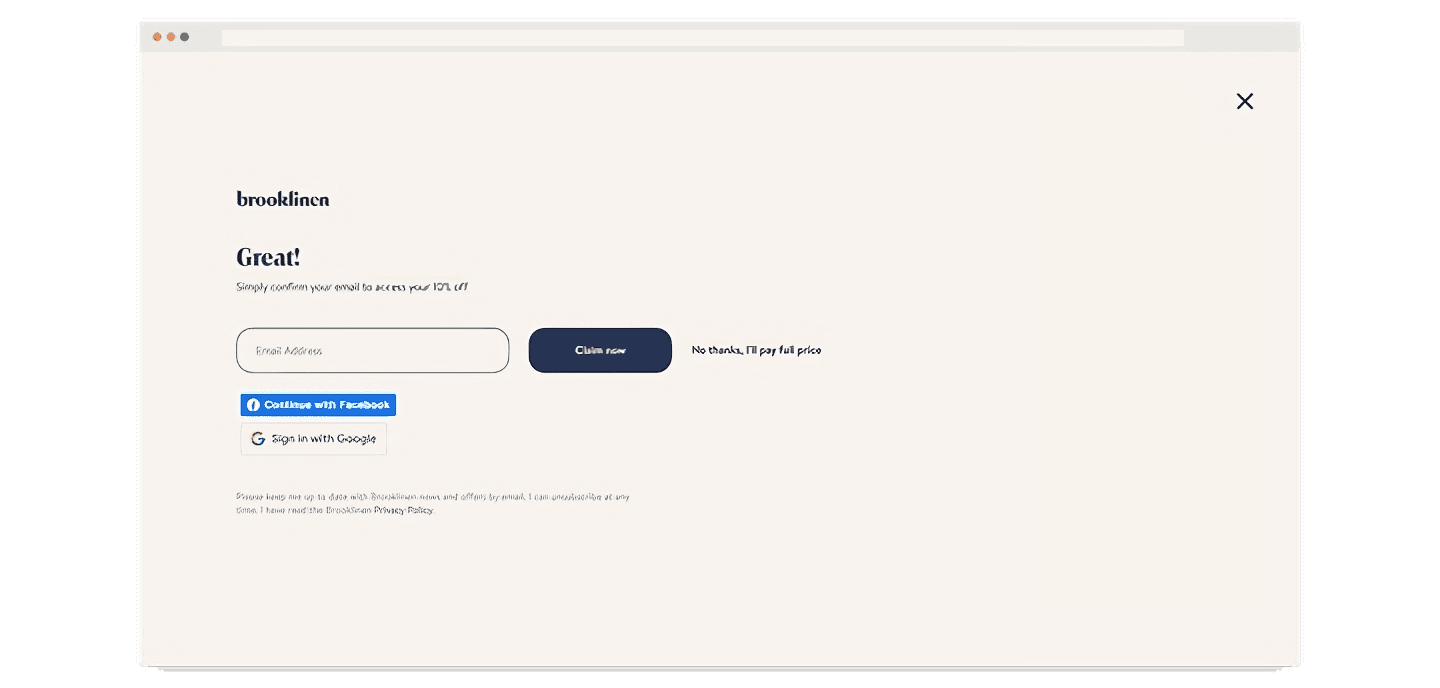
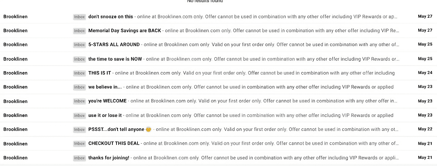
Brooklinen applies the rule of "hit them hard, and early" in email marketing. As soon as someone signs up on their website, they send them multiple emails per day to quickly communicate their value.
While this approach may come off as spammy, Brooklinen co-founder Rich Fulop has a reasoning behind the method. His view is that if someone has signed up on the website, they are definitely interested in either the product or the company, and they must strike while the iron is hot. “If you’re pitching it well, and if they’re genuinely interested, they’re going to buy either from you or a competitor, or some place else within the next few days,” he says.
As an indication of their rate of email sending, Brooklinen has been observed to send 11 emails over a span of five days as a result of their welcome email sequence. (Image from Medium) Read more.
Add a countdown timer on your homepage.
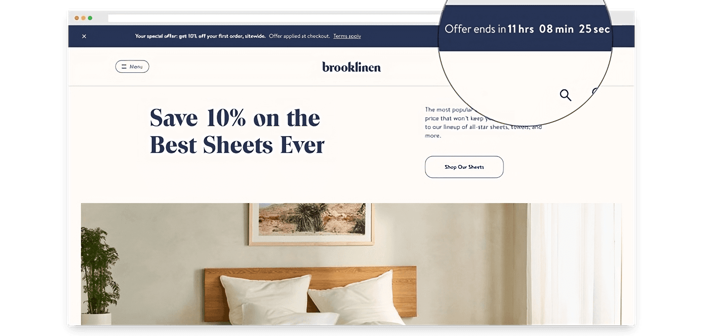
Brooklinen uses a countdown timer on their homepage during promo periods to inform visitors of their special offer and create a sense of urgency to encourage purchases. The timer is a simple and effective way to prompt visitors with purchase intention to convert.
Delight site visitors with an engaging, informative quiz.
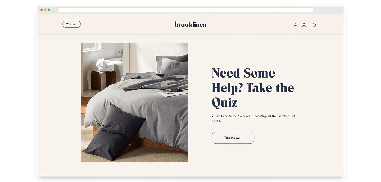
Quizzes are fun additions to your homepage that encourage visitors to interact more with your website and learn more about your products. Brooklinen offers a quiz that gives product recommendations to visitors based on what they’re looking for and their preferences.
This quiz is not used as a lead generation tool; it gives the answers upfront, adding to the delight of the potential customer. This also allows visitors to take the quiz multiple times, learning more about Brooklinen’s product offerings in the process.
What do you think of these strategies? Might they work for you? We’d love to know - share your stories with us!
