Growth Strategies
28.02.2023
TLDR
Cart abandonment is a significant challenge for direct-to-consumer (DTC) brands, with an average abandonment rate of nearly 70%. To reduce cart abandonment rates, DTC stores should focus on optimizing their checkout process. This involves simplifying the checkout flow, automatically applying discounts, offering multiple payment options, providing a guest checkout option, using progress indicators, avoiding hidden costs, and preempting payment failures with suitable messaging. Monitoring checkout rates through tools like Airboxr can help track the impact of optimization efforts and improve the overall shopping experience for customers.
For many direct-to-consumer (DTC) brands, one of the biggest challenges faced on their online store is cart abandonment. Cart abandonment happens when customers add items to their shopping carts, but fail to complete the purchase.
The average documented online shopping cart abandonment rate is 69.99%, according to Baymard Institute.
That means a whopping 7 out of 10 shopping carts never make it through the checkout page. That's a lot of missed revenue!
Typically, the main reason for checkout abandonment is a poor checkout flow. A checkout flow refers to the steps that a customer has to go through in order to complete a purchase. If the checkout process is too complicated or lengthy, customers may get frustrated and abandon their carts. Hence, it is critical for DTC stores to optimize their checkout flow in order to reduce cart abandonment rates. A well-designed checkout flow should be simple, streamlined, and easy to navigate - and we'll show you how to make that happen.
This article will provide you with a checklist of solutions you can use to tackle hidden problems with your checkout and payment process. You may wish to implement these solutions one by one, so that you can properly measure the impact of your efforts on your cart abandonment rate. Bookmark this page so you can come back to it when needed.
Simplify your checkout process
Have you ever tested your checkout process to assess how easy it is to use? If not, you should do that right now. Go through the entire checkout flow from your landing page, to adding to cart, to the checkout page, and finally through to payments. (Use a testing environment for payments, unless you want to buy gifts for all your friends at the same time!) Ask yourself these questions:
How many pages did I land on?
How many times did I have to click a button?
How many times did I have to type in my information?
Did I get stuck or halted at any point in the process?
Once you've reviewed your checkout flow, bring your entire team together and brainstorm ways in which the flow could be streamlined. Your aim is to reduce friction in the checkout process by minimizing the number of steps required to complete a purchase and minimizing the amount of information customers need to provide.
Sustainable shoe brand Allbirds has a seamless checkout process that takes a new customer from landing page to checkout page without interruption. They do not require users to log in or create an account before making payment; in fact, they make it easier for customers to pay by offering express checkout options right up top, where previously saved shipping and billing information is already stored. This helps save customers time as they need not key in their payment information again.
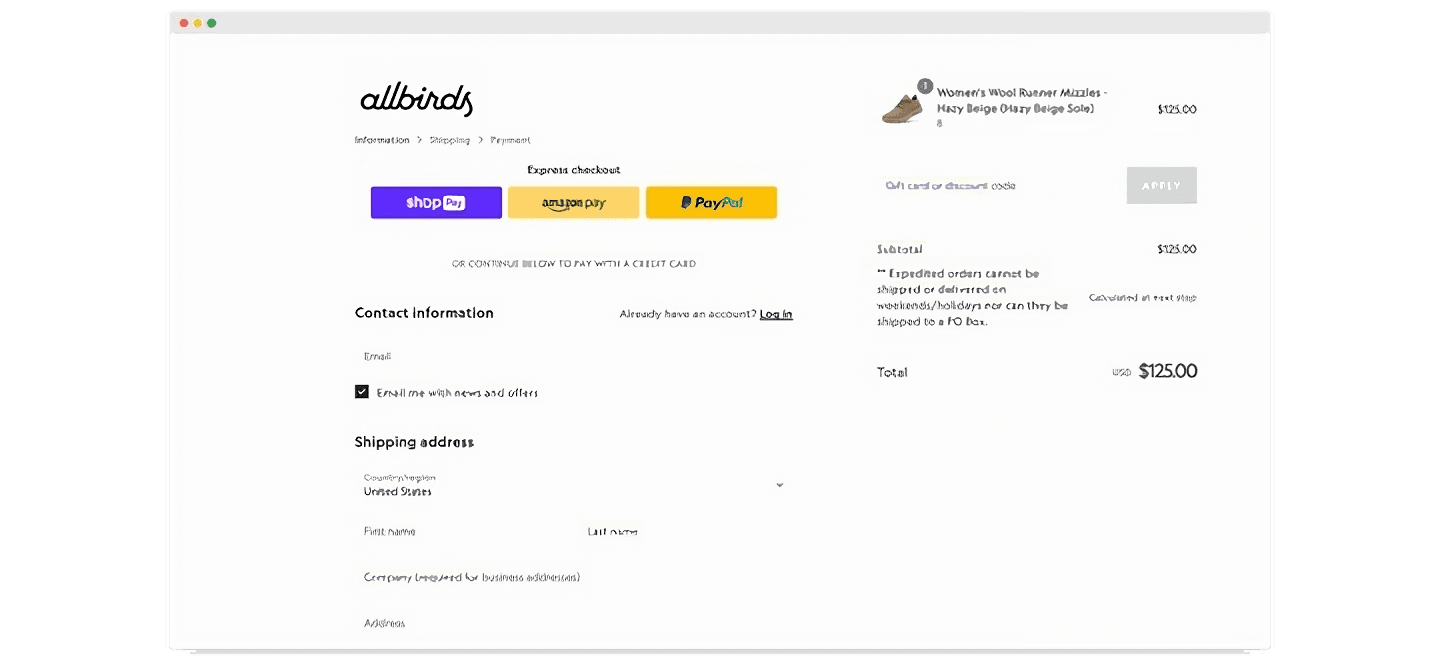
The fewer pages a customer has to see before payment, and the fewer times they have to key in their information, the smoother their checkout process will be.
Automatically apply discounts on the checkout page
How can you make it easier for customers to take advantage of your promotions? By making it as seamless as possible for them to go from seeing the promotion to paying for their items. The best way to do this is to automatically apply discounts for the relevant items at checkout. This also applies if you offer free shipping.
Beauty brand Glamnetic does this well. On their homepage, they entice customers with an attractive offer. Clicking the button takes visitors to a special campaign page showing a collection of items for browsing, all of which indicate the promo price as well as the campaign name. And on the checkout page, the promo code is automatically applied.
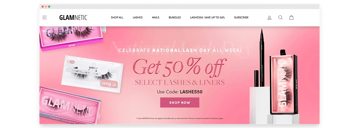
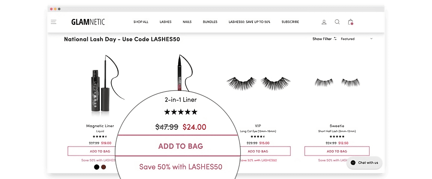
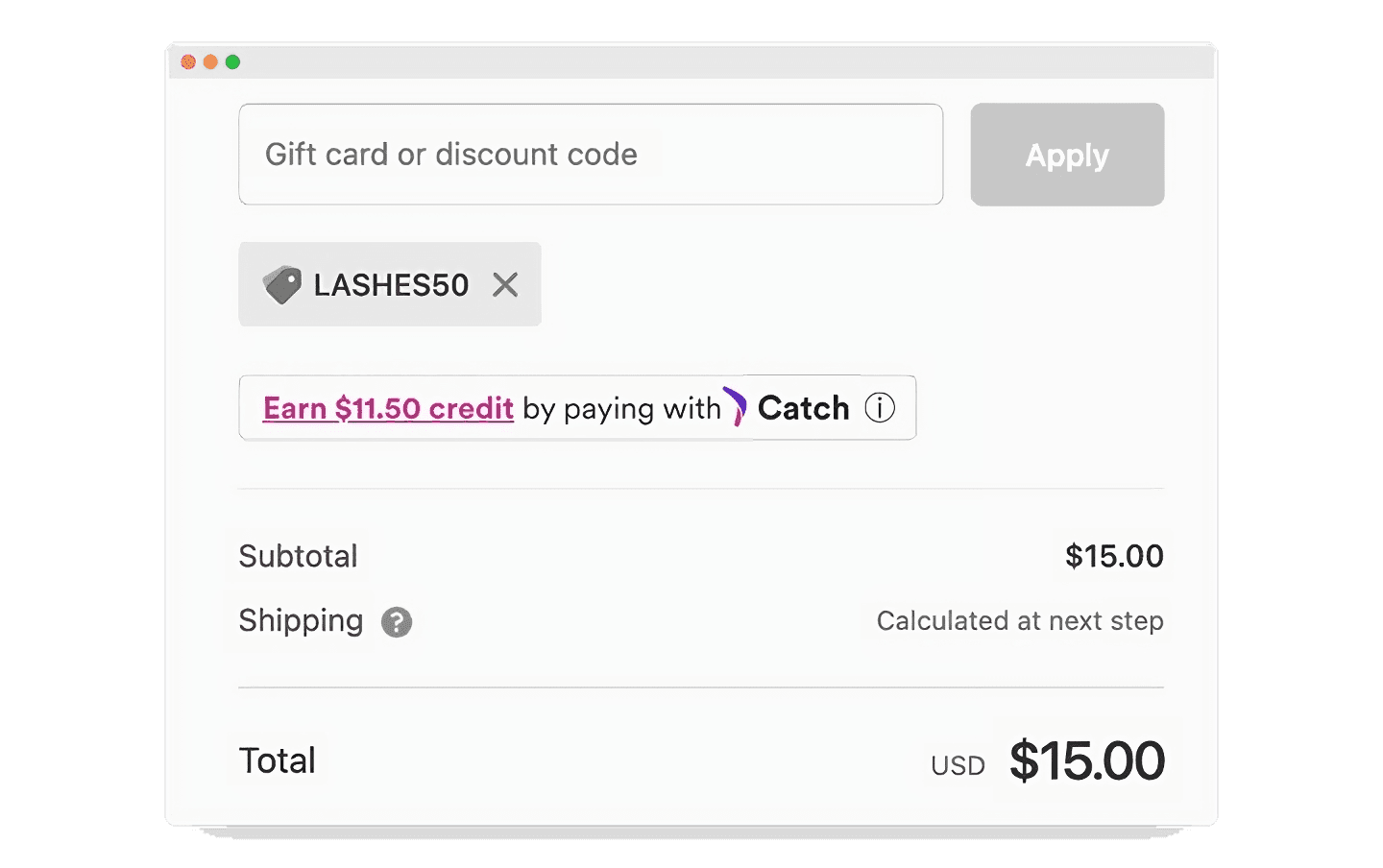
By guiding the customer throughout the buying journey, indicating the availability of the promo every step of the way, the customer feels reassured that they will be able to take advantage of this promotion on the items they have selected. They are not surprised at checkout to discover that the item they chose does not qualify under the promotion, which is one of the factors that cause cart abandonments.
Offer multiple payment options
Sometimes, cart abandonment happens because potential customers simply do not have a convenient way to pay for their order. To prevent checkout abandonment due to a lack of payment options, you should offer as many payment options as you can. This could include credit cards, PayPal, Apple Pay, Google Pay, Shop Pay, Klarna, Afterpay, or other payment methods.
Eyewear brand Epokhe offers multiple payment options, but cleverly displays them in such a way as to not clutter their landing page or confuse their visitors. On the landing page itself, they announce their buy-now-pay-later payment solution Afterpay, which customers can select at checkout (if they fall within the regions covered). For immediate full payment, customers can select Shop Pay directly from the landing page - skipping the traditional checkout page altogether. As for the other payment options such as keying in credit card details, customers can click on 'More payment options' which will bring them to the checkout page.
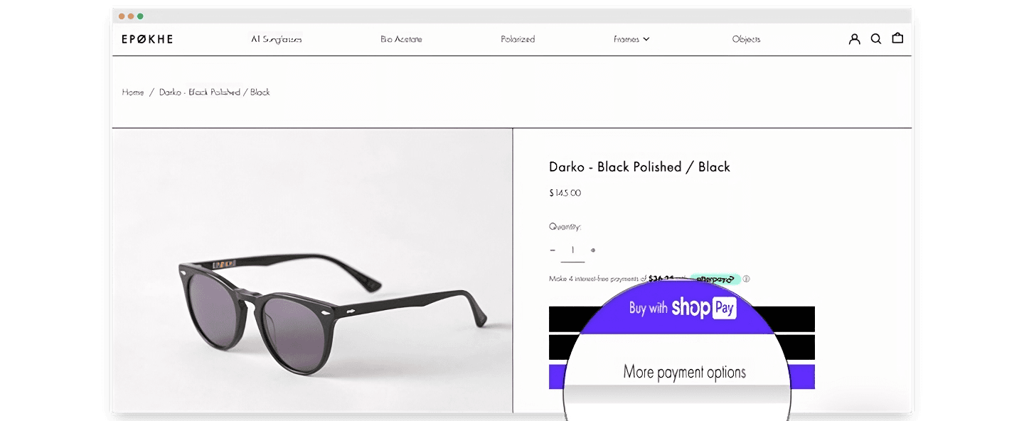
Offering multiple payment options is necessary, but by making it easier to choose one over the others, Epokhe is able to also streamline a customer's payment process.
Provide a guest checkout option
For customers who don't want to create an account or log in, it's important to provide guest checkout options. This allows customers to complete their purchase without having to provide additional information or create an account.
Skincare brand Paula's Choice encourages shoppers to sign in on their website before making a purchase, even offering the option to sign in with Facebook. By doing so, they are able to collect first party data on their website, which gives the company a much clearer understanding of their customer base, allowing them to in turn improve their marketing and product strategies to better serve their customers. However, they do provide flexibility by offering guest checkout for online shoppers who do not wish to create an account.

While this guest checkout option appears on a separate page, it can sometimes also be integrated into the checkout page, depending on the company's aims and how the website is designed.
Use progress indicators to set customer expectations
For some companies, especially those selling products tend to take a longer buying journey, it may be more important to collect customer information than to get the customer to checkout in the shortest time possible. In this case, it would be interesting for stores to guide their customers through the checkout process using progress indicators. This shows customers how far along they are in the checkout process and how many steps they have left to complete.
Casper, a mattress company, uses progress indicators to help customers navigate the checkout process. The first step involves asking the customer for their contact information, where the checkbox to subscribe to their mailing list is automatically checked. To avoid customers feeling the friction of having to submit their contact information before being able to make a purchase, the site indicates that the checkout process is only three steps. This helps to manage the customer's expectations.
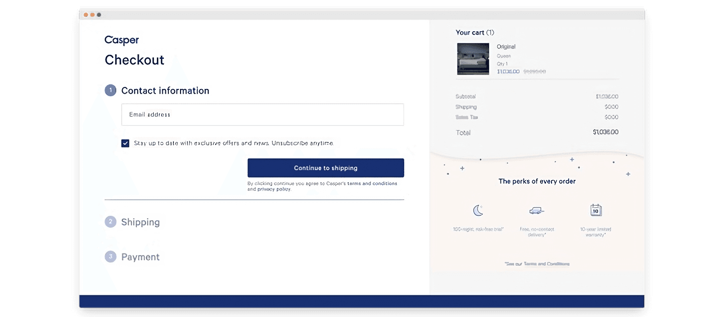
It is interesting to note that without providing contact information, a customer is unable to make their purchase. This is reasonable given that the products sold are usually above $1000, and at this relatively high price point for ecommerce, it is extremely important for the shop to be able to contact the buyer in case of any issues.
Improve your DTC game. Sign up for weekly tips.
Avoid surprising online shoppers with hidden costs
One of the easiest ways to ruin a customer's online shopping experience is to slap them with unexpected costs just before checkout. These can be unexpected shipping costs (especially for locations far from the fulfilment centres), additional card fees, or other extra costs.
There are a few ways you can prevent this, and provide a more pleasant shopping experience.
One way is to have dedicated websites serving different markets. If you are an e-commerce store, you may offer international shipping. However, you can better manage your sales (and your customers' expectations) by using regional stores.
Dr Squatch, a skincare company, automatically detects the geographical location of online visitors, and prompts them to switch to the site that would serve them better.
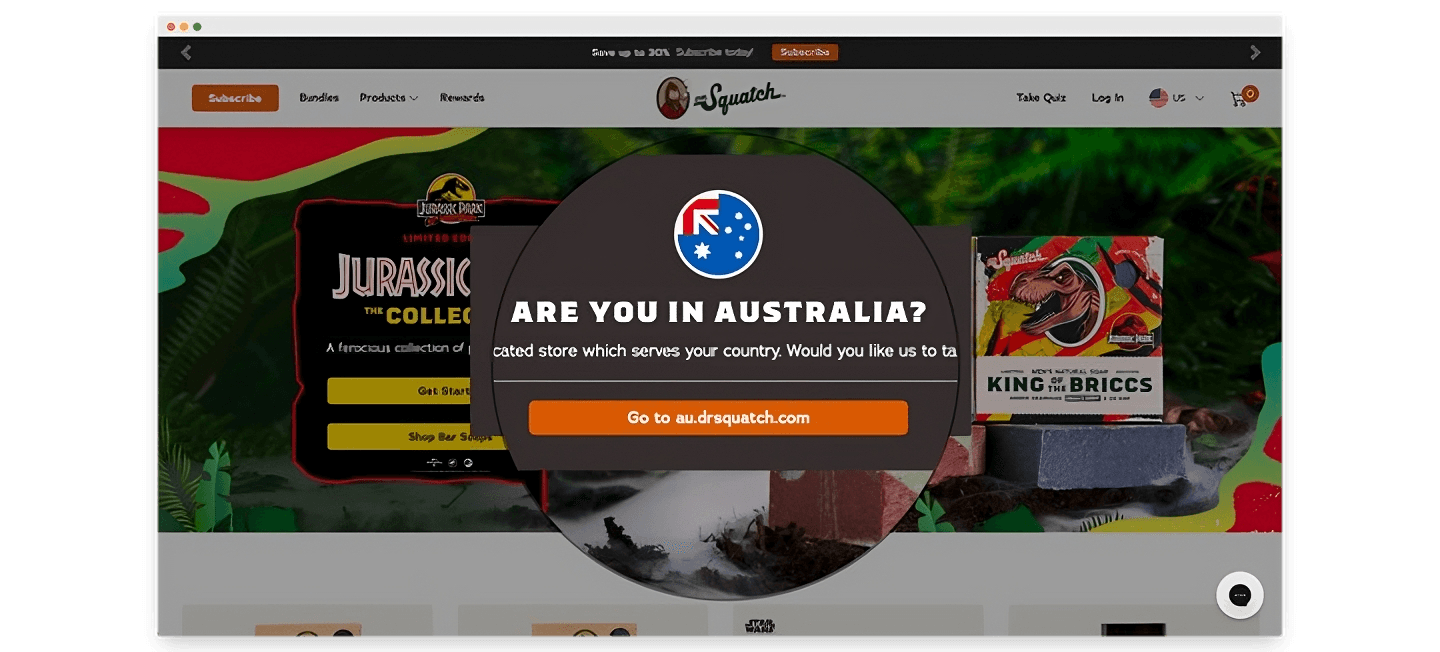
One major benefit of this is the regional store is able to closely tie their operations with the information published on their online store. This allows them to display more accurate shipping and stock information based on the location of their fulfilment centre. Simply put, a customer in Australia will not be surprised to see that their order is being shipped from the United States, and that they will bear the cost of long distance shipping.
Other things you can do to be upfront about potential hidden fees is to be very clear about additional credit card charges or platform fees on your checkout page.
Pre-empt payment failures with suitable messaging
Sometimes, customers abandon their purchase even after they have checked out, which is right at the very end of the ecommerce checkout process. This is the most frustrating outcome for both customers and merchants, as the customer has already gone through the whole purchasing process but is unsuccessful in making their purchase.
While this is a matter usually handled by the payment gateway being used, ecommerce retailers can also play their part in ensuring a smooth purchase process. There are three reasons why payment failures may occur:
Card issues, e.g. insufficient funds or card expiry
Checkout flow issues, e.g. incomplete information given
Website issues, e.g. a misconfigured payment gateway setup
Interestingly, all of these reasons can be solved by implementing suitable messaging.
A study by Baymard Institute showed that they were able to salvage 30% of "card declined" sales though one simple method: offering customers to use an alternative payment method instead.
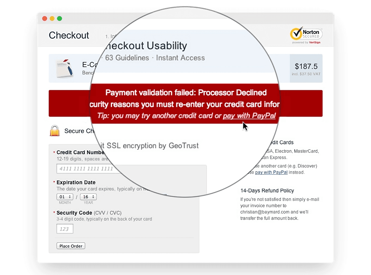
The solution, therefore, is to offer one or more entirely new payment methods directly in your "card declined" error message. The sooner a customer sees it, the more convenient it is for them to try a new payment method, and the higher the probability that they will complete their purchase.
While implementing this solution on your website may require technical assistance, you may also consider sending this message via a follow up email, should the customer fail to complete their purchase after a certain amount of time.
Monitor your checkout rates
The key to understanding your impact on the checkout flow is to be able to effectively track checkout rates on your ecommerce website. We can do this easily using Airboxr.
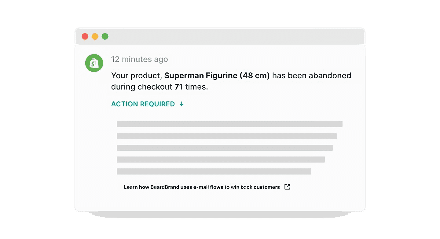
Once you log in to Airboxr, you will see a dashboard which includes a timeline of automated insights into your ecommerce business, which we call Timeline Hops. One of these insights shows you your abandoned checkout rates during the given time period. By checking your Timeline Hops weekly, you will be able to tell if your efforts in reducing cart abandonment have been effective.
These are the main ways you can achieve checkout optimization on your ecommerce website. If you have other methods to suggest, write to us at hey@airboxr.com.
